 A description of purpose, implementation, and utility of micro interactions as well as a gallery of good looking examples.
“Big” is, and has always been, made up of lots of small. Just as a multitude of sand makes up a beach, dozens of contact points between user and UI make up a pleasant user experience. The idea is to get users concentrating so hard on the forest (your product) that they don’t see the trees (microinteractions). While normally this is a metaphor used to convey a regrettable lack of focus, in this case the goal is to have users paying attention to the big picture.
The way to do this is by allowing users to accomplish inauspicious tasks throughout the user flow on your site/app/what-have-you, boosting engagement and encouraging interaction along the way. This all leads to their (and your) eventual goal.
What are Microinteractions ?
Microinteractions are the points of contact. They are, scientifically speaking, are limited processes within a product (website, application, etc). They focus on a lone user goal such as pulling to refresh, verifying an action, or unlocking a device.
You may not be familiar with microinteractions as a concept, buy you’re certainly familiar with their applications. A microinteraction can be used for any of the following:
- Regulate a continuous function like a device’s volume
- Adjust a setting
- View or create a thin slice of content such as a drop-down menu
- Even something as simple as turning a device on or off
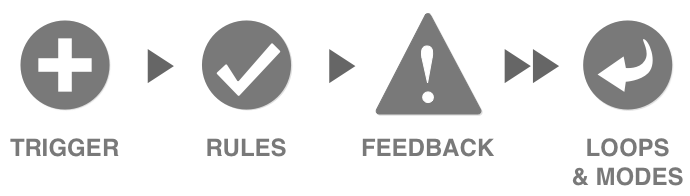
All of these are microinteractions. But even something so small it’s dubbed “micro” is still the sum of more miniscule parts. There are four points to any microreaction: a trigger, rules, feedback and loops/modes.
Triggers
There are two types of trigger: manual and system. Manual triggers are user-initiated, while system triggers are automated. The difference would be a user clicking something and expecting a result versus a system prompt that would ask the user to take action.
Rules
Rules are the constraints on, and parameters of, a user flow. Rules basically govern the way a user interacts with the product. As such, rules are usually intuitive and understated. For instance, when a user clicks “login” the rules would state that they must enter their username and password, then click “submit.” This is intuitive because it relies on prior user knowledge, something we’ll dig deeper into a little farther on.
Feedback
Feedback can be visual, aural, or tactile. Visual is by far the most predominant means of providing feedback, as aural can be annoying, and tactile is reserved for touchscreens only. An example would be a visual cue in response to an action, something like an animated icon transition in response to the mouse hovering.
Loops/Modes
Loops determine how long the microinteraction goes on for. Does the microinteraction end immediately, or does it repeat forever? There are two kinds of loops: open and closed.
- Open– these don’t respond to feedback, they execute and end
- Closed– these are self-adjusting: adapt over time to user feedback
An example of a loop would be a countdown timer that starts and displays how much time you have left to edit a recent post on a website, like comments on SB Nation.
Modes, on the other hand, are a bit different. They’re basically a sub-interaction that takes away from the main purpose of the microinteraction. As such they should be used exceedingly sparingly, if not avoided altogether.
The Vine app provides a good example of modes. When you touch the screen on your mobile the app records and when you stop touching the screen, the recording pauses. There’s no button involved, you just record or pause based solely on touch.
Obviously, modes can be extremely distracting to a user, so their use should be minimized if at all possible.
What do Microinteractions do?
It’s generally understood that microinteractions are what make or break UX. They move the user through the navigation patterns, providing encouragement and familiarity along the way. They reduce stress, overwhelm, and fatigue while increasing enjoyment, engagement, and memorability. In sum, they allow a user to either express or consume data/content efficiently.
Oddly enough, despite their incredible efficacy and pivotal importance, microinteractions rarely get their due credit. This is because they are supposed to be “jobbers,” to borrow a pro wrestling term. They are the inconspicuous items within an overall UX which puts the product over in the mind of the user. They take center stage for a short moment in order to achieve a specific mini-task that helps the user towards their main goal.
Doing this without distracting too much from that main goal is a tricky balance.
Micro Interactions Best Practices
Intuitive micro interactions work on a principle of cause and effect. A user commits an action, the interface responds. These causes and effects should be as predictable as possible, following familiar patterns that users already have down pat. The login/signup process we mentioned earlier is so ubiquitous that it’s instinctual at this point. This kind of familiarity is what drives user intuition, and that’s what clever microinteractions leverage.
That means most flows must determine which actions your users are most likely to take and highlight those paths with microinteractions. That means subtlety. Small suggestions that illuminate the information most desired. Therefore, microinteractions need to be as simple as possible. To simplify, you’ve got to consider all the data in your product that a user would be compelled by. Once you’ve established that, you need to brainstorm how that content can become an effective trigger for a microinteraction.
Once the microinteraction is triggered, the rules should be simple, yet well defined, with clear constraints that limit a user’s options. This demarks a clear path forward and limits overwhelm. List all of the basic rules you can think of for each interaction and try to add constraints. Test your rules a/b style and make adjustments accordingly.
An important thing to note: when providing feedback, less is always more. Provide as little feedback as possible while still achieving the goal of validating the user’s action. This way you won’t distract from the larger purpose.
Other tricks you can use to minimize potential blowback from feedback are humor and visual appeal. Many 404 pages employ humor to keep users from getting too frustrated with their missteps. And animations such as CSS transitions invoke a very positive user reaction in most cases.
Loops can likewise have a big impact on UX. If users aren’t presented with ample opportunity to interact they’ll feel rushed and frustrated, but if there are too many opportunities within a microinteraction then the whole thing will feel slow and irritating.
Finally, one of the most important things you can do with your microinteractions is to eliminate the opportunity for human error. This boils down to limiting user choices or expanding upon feedback when users make a mistake. Google does this really well. They’ll try to correct improper search terms, automatically suggest the end of a search query, and even keep you from sending an email without an attachment.
But perhaps the best way to appreciate microinteractions is to see them in action. Here are ten awesome examples.
Microinteractions Gallery
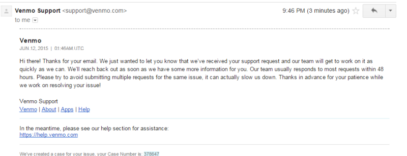
1. This is an automated email notification from Venmo, the peer to peer payment app. It’s sent as soon as a message to the support staff is received. Venmo can’t solve all of their customer’s problems instantly, but when monetary transactions are taking place, it’s important to establish that the issue is getting addressed.
2. Side Menu
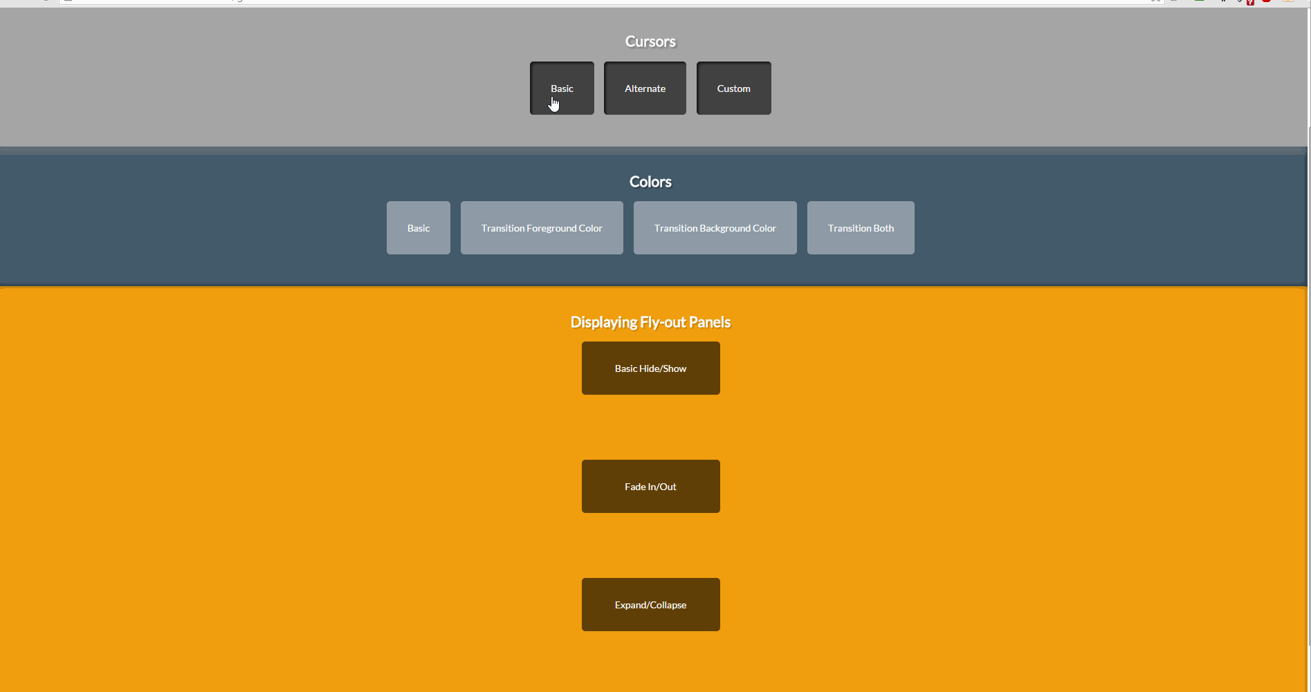
Mouse hover to menu expansion via gorgeous animated transition. Subtle and effortless, a perfect microinteraction.

Click, transition, verification. Another great example of less being more.
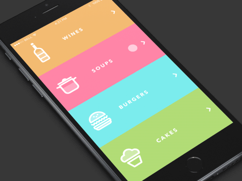
This microinteraction simply allows a user to scroll through their menu options at a restaurant. Enable without distractions: a key microinteraction maxim.
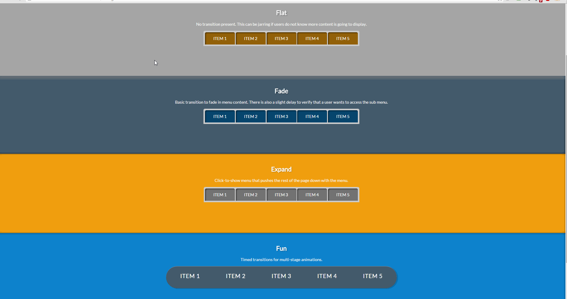
6. General Transitions
This link features some general examples of proper microinteraction implementation for a website.
7. http://microinteractions.onenorth.com/data
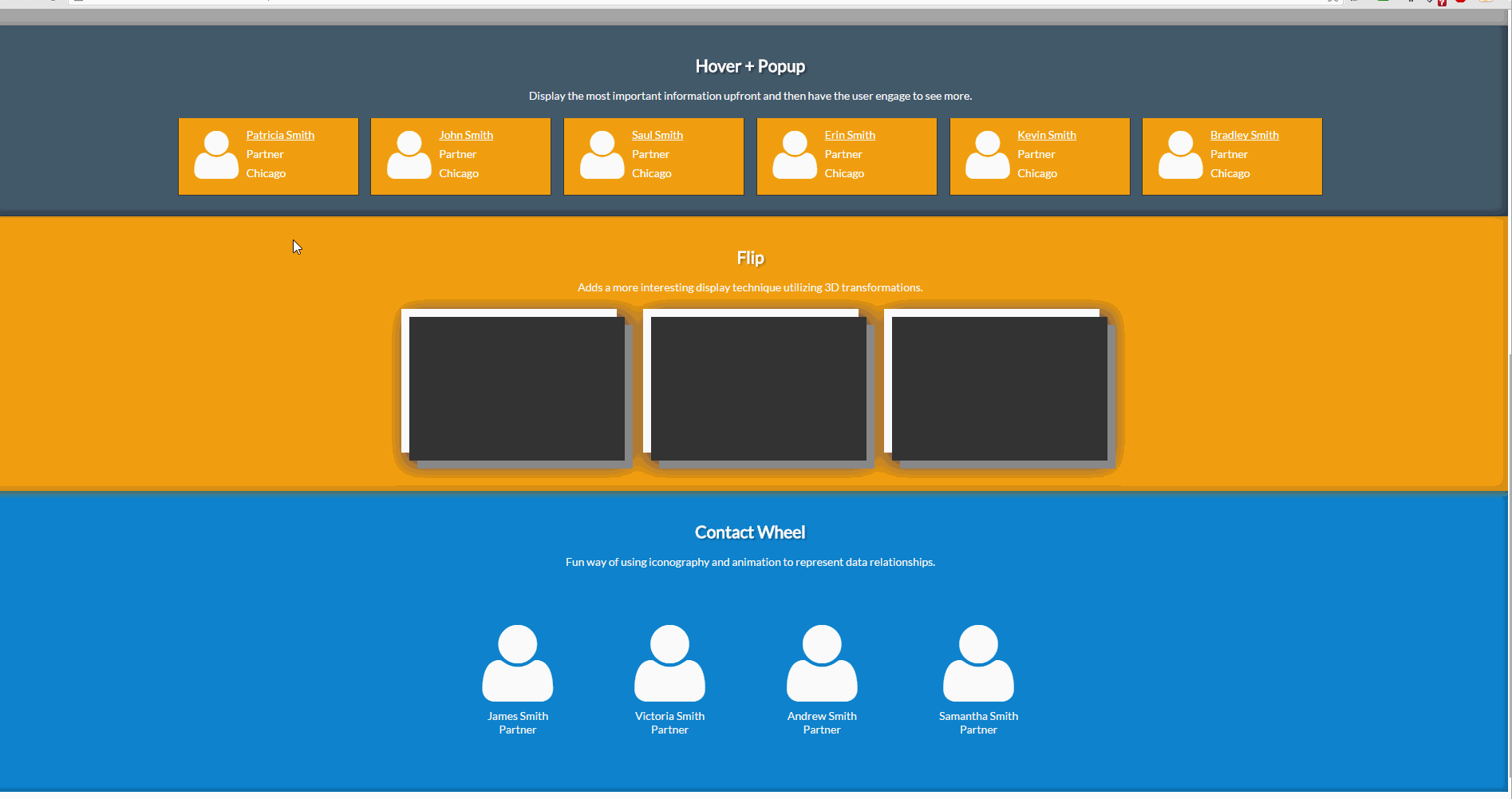
Here we see more of the same general principles applied to a specific case: the expansion of data in response to mouse hovering.
8. Navigation
Navigation patterns are paramount in the microinteraction hierarchy. Users have to travel through your site, and need to be directed and rewarded for doing so.
9. Long Content
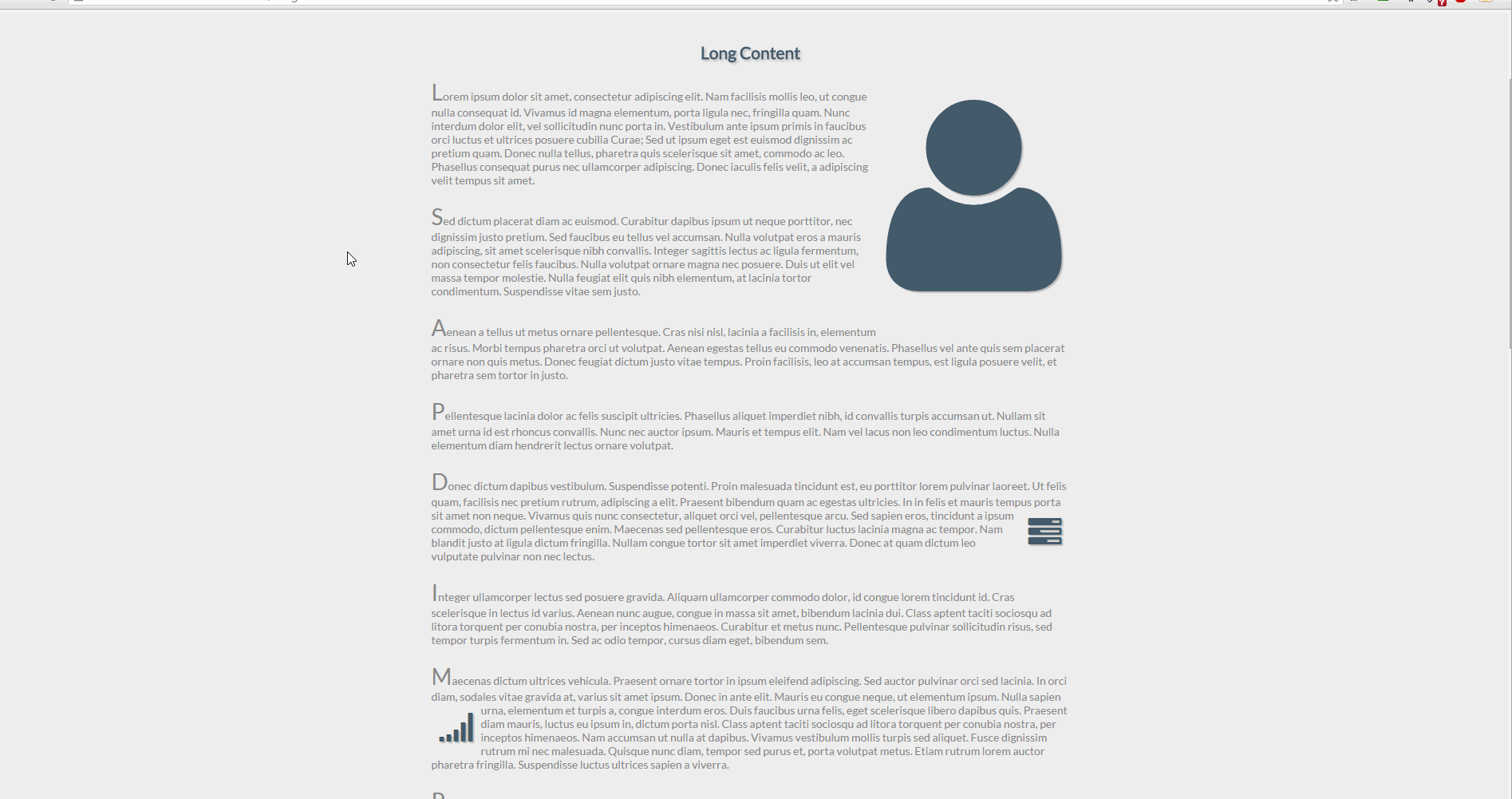
Holding user attention can be troublesome at the best of times. Having a subtle microinteraction accompanying them through a particularly long piece of content can make all the difference.
10. Hover Zoom
Want to see that item up close? Microinteractions can help with that.
As you can see, microinteractions serve an incredibly versatile purpose. They are the meat and potatoes of any UX. Keep the details in mind while designing and your users are sure to stay engaged. What are your favorite microinteraction examples? Let us know in the comments.